The Power of Color Theory in Branding
Color theory is a captivating study that delves into how colours interplay, blend, and wield influence over human perception and emotions. When it comes to branding, colour theory plays a pivotal role because colours have the remarkable ability to elicit specific feelings, establish associations, and convey powerful messages. In this post, we’ll explore the fascinating world of colour theory and its profound impact on your branding efforts
1. The Color Wheel: A Fundamental Tool
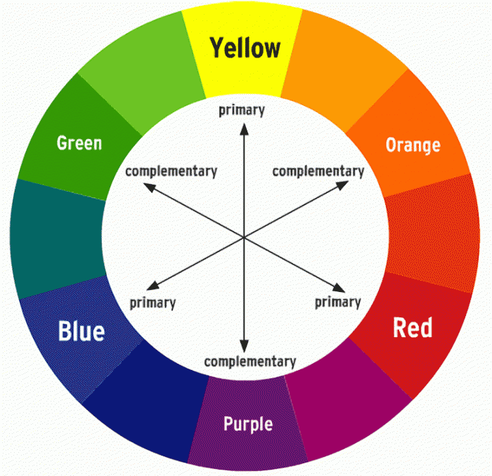
At the core of colour theory lies the colour wheel, a fundamental tool for designers and brand creators alike. The colour wheel is a visual representation of colours, consisting of primary colours (red, blue, yellow), secondary colours (green, orange, purple), and tertiary colours (resulting from the mixture of primary and secondary colors). This wheel serves as a compass, guiding designers to understand the intricate relationships between colours and how they interact harmoniously.

2. Crafting Color Harmony
Colour harmony is the art of skillfully arranging colors to create visually pleasing combinations. Different colour harmonies can evoke varying emotional responses in viewers. Some common colour harmonies include:
-
Complementary Harmony: This involves using colors that are opposite each other on the color wheel. It creates a dynamic and eye-catching contrast.
-
Analogous Harmony: This approach employs colors that are adjacent to each other on the color wheel. It results in a soothing and harmonious visual experience.
-
Triadic Harmony: This harmony involves selecting three evenly spaced colors on the color wheel. It yields a balanced and vibrant composition.
The choice of colour harmony can profoundly affect how your brand is perceived.
3. Color Meanings and Associations
Colours possess a language of their own, as they are often associated with specific meanings and emotions.
Here are some common colour associations:
- Red: Passion, energy, love, excitement
- Blue: Trust, calmness, professionalism
- Yellow: Cheerfulness, optimism, warmth
- Green: Nature, growth, health
- Purple: Royalty, creativity, luxury
These associations can significantly influence how people perceive and interact with your brand. Selecting the right colors aligns your brand with the emotions and values you wish to convey.
4. Cultural and Contextual Nuances
Colour meanings can be culturally and contextually nuanced. A colour that signifies purity and weddings in one culture may symbolize mourning in another. When branding for a global audience, it’s crucial to be aware of these nuances to ensure your color choices resonate positively.
5. The Science of Colour Psychology
Colour psychology delves into how colours impact human behavior and decision-making. Businesses leverage colour psychology to influence consumer choices and actions. For instance, fast-food brands often employ red and yellow to stimulate appetite and encourage quick dining.
In conclusion, colour theory is an indispensable tool in the world of branding. It empowers you to strategically select colours that align with your brand’s personality, resonate with your target audience, and effectively communicate your brand’s message. By harnessing the principles of colour theory, you can create a visual identity that not only captures attention but also leaves a lasting impression. So, when you’re crafting your brand’s identity, remember that colors are more than just pigments—they’re powerful instruments that can shape perceptions and drive engagement.


