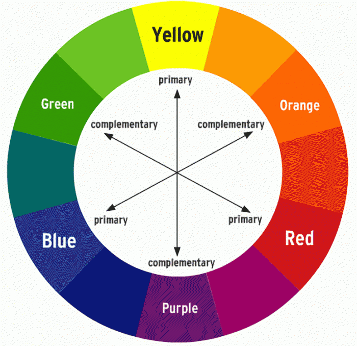
Colour Theory in Business (part 1):
Choosing the Perfect Palette for Your Brand and Website
Know Your Brand’s Personality
Your brand’s personality is like its unique fingerprint. It defines how your brand is perceived by others. Before you dive into the world of colour theory, take a moment to consider the personality traits and values your brand wants to convey. Are you aiming for a professional, playful, modern, or traditional image?
Colour theory can help you communicate these traits effectively:
- Blue: Trustworthy, professional, calm
- Red: Energetic, passionate, bold
- Green: Natural, sustainable, healthy
- Yellow: Optimistic, cheerful, youthful
- Purple: Creative, luxurious, imaginative
- Black: Sophisticated, powerful, elegant
- White: Pure, clean, minimalistic

Understand Your Target Audience
Your brand exists to serve your audience, so understanding their preferences is paramount. Analyze your audience’s demographics, preferences, and cultural backgrounds. Certain colours may appeal more to specific age groups or cultural contexts. Tailoring your colour theory to your audience ensures that your brand resonates with them on a deeper level.
Consider Industry Standards
While standing out is important, it’s equally crucial to consider industry standards. Some industries have established color conventions that can either help or hinder your brand’s recognition. Striking a balance between differentiation and adherence to industry norms is a delicate art.
Psychological Impact of Colours
Colours have a profound psychological impact on people. For instance, blue is often associated with trust and reliability, making it a popular choice in finance and healthcare. Understanding these associations can help you make informed colour choices that align with your brand’s goals.

Contrast and Readability
On the web, readability is king. Ensure that your chosen colour scheme provides good contrast for text and background. High contrast is essential for web accessibility and user experience.
Accessibility
Think about accessibility guidelines when selecting colours. Ensure that your palette accommodates individuals with visual impairments. Tools like colour contrast checkers can assist in this regard.
Versatility
Your brand’s colour palette should be versatile and work well in various contexts, from websites to print materials to social media.
Competitive Differentiation
Research your competitors’ colour choices. Select colours that help your brand stand out while still aligning with your identity and industry.
Test and Iterate
Don’t be afraid to experiment. Conduct A/B testing to see how different colour schemes affect user engagement and conversions.
Cultural Sensitivity
If your brand has a global audience, be mindful of cultural interpretations of colors. Colours can hold different meanings in different cultures.
Logo and Visual Identity
Your logo is often the anchor for your brand’s colour palette. Ensure that your chosen colours complement and enhance your logo’s design, creating a cohesive and memorable visual identity.
Consistency
Consistency is key to effective branding. Once you’ve chosen your brand colours, use them consistently across all brand materials, including your website, social media, marketing collateral, and physical spaces. This consistency reinforces your brand’s identity in the minds of your audience.
In conclusion, selecting the right colours for your brand and website is a thoughtful and strategic process. It’s not just about aesthetics; it’s about conveying your brand’s personality, resonating with your audience, and communicating the right message. To ensure you make the most impactful color choices, consider seeking input from design professionals or conducting market research to validate your selections. Remember that colours are a powerful tool in brand communication, and a well-thought-out palette can make a significant impact on your brand’s success.


